
Ask an operations manager how their fleet is doing right now, and you'll usually get an honest but uncomfortable answer: "let me check a few things." A tab for trips, a spreadsheet for margin, a WhatsApp group for incidents, a separate compliance tracker for driver documents. None of it is wrong — it's just scattered, and scattered data has a way of hiding exactly the thing you needed to see five minutes before it became urgent.
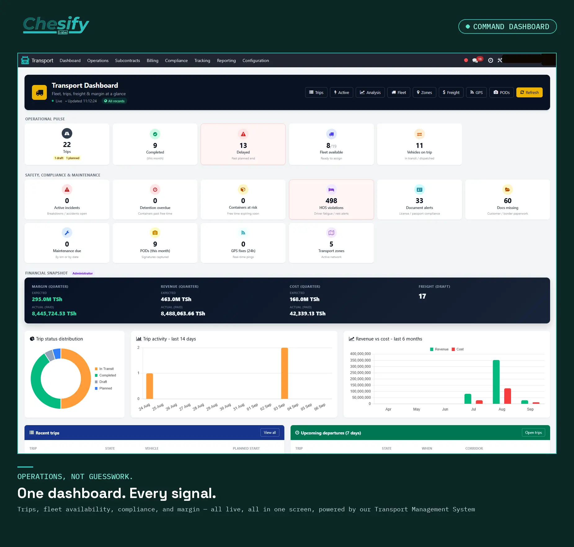
The command dashboard in our Transport Management System exists to close that gap: one screen, live, with every number tied back to a real record you can click into.
Three questions the dashboard has to answer instantly
We didn't design this around "what metrics look impressive." We designed it around the three questions an operations manager actually asks first thing in the morning:
Is anything on fire right now? Active incidents, containers approaching detention, HOS violations, and expiring driver documents all surface together under one "Safety, Compliance & Maintenance" section — not buried in four different menus.
What's actually moving? Trips, fleet availability, and vehicles currently on the road, at a glance, with draft and planned trips called out separately so nothing gets lost in an "in progress" bucket that hides what still needs action.
Are we making money on it? A financial snapshot — margin, revenue, and cost — sits right alongside the operational numbers, because freight margin isn't a finance-department question answered a week later; it's an operations question that changes daily.
Every tile is a door, not a wall
The design principle we kept coming back to: a dashboard tile that just displays a number is only half-useful. Click "HOS Violations" and you land on the actual list of violations, not a chart you have to go interpret. Click "Maintenance Due" and you're looking at the real service records. The dashboard's job is to compress the whole operation into one view without hiding the detail behind it — visibility first, drill-down always available.
What we learned building it
The tempting version of a dashboard is the one that looks good in a demo — clean, colorful, static. The useful version is uglier in exactly the right ways: red tiles that stay red until someone actually resolves the underlying issue, trip counts that include the awkward "1 draft, 1 planned" caveat instead of rounding it away, and a trip-activity chart that shows the quiet days honestly instead of smoothing them into a trend line.
Operations dashboards fail quietly when they're built to look reassuring. Ours is built to be checked first thing every morning and trusted.
If your team is currently reconstructing "how's the fleet doing" from four different tools every morning, that's exactly the problem this was built to solve. Get in touch — we'll show you what one screen can actually replace.
Chesify Labs builds Odoo-based operational systems for logistics, freight, and fleet-heavy businesses across East and Southern Africa.